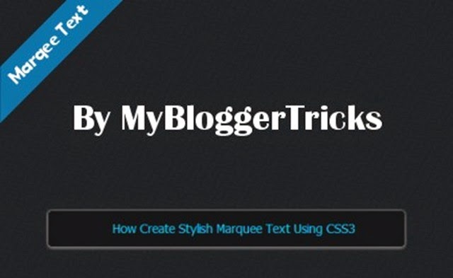
 The marquee <marquee> has a lond and rather dismal history, going all the way back early of the internet explorer. Never standardized element nor a part of any HTML Spec, <marquee> was commonly used to create a scrolling “Ticker Tape” effect for text on the webpages during the late 90s. In this tutorial we’ll learn to create basic animated marquee text using CSS3 technique. The techniques used in this tutorial will help us to create much more complex animations in the future tutorials. So now it’s time to put on that creative hat, roll up our sleeves and dive into awesomeness!.
We are all done with our marquee text; let’s see the live preview on the browser.
Create HTML Markup For Your Animated Marquee
Our HTML Code is so simple look like below.<div class="marquee-wrapper">
<marquee behavior="infinite" direction="left" scrollamount="2" onmouseover="this.stop();" onmouseout="this.start();"><span class="marquee"><p><a href="http://www.mybloggertricks.org//">How Create Stylish Marquee Text Using CSS3 </a></p>
</span></marquee>
</div>
With the above html markup users can stop the marquee text when they hover over the marquee text with their cursor. The marquee then continues when the user hovers away from the marquee. You can also make the marquee text slow down by changing the scroll amount value.
After making the html markup we need to create CSS3 styles like width, height, text shadow, inner shadow, background color, borders and also height and line-height.
.marquee-wrapper{
width: 900px;
max-width: 960px;
background: black;
height: 40px;
overflow: hidden;
position: relative;
border: 1px solid #000;
border-radius: 5px;
margin: 25px auto;
text-align: center;
-webkit-box-shadow: inset 0px 2px 2px rgba(0, 0, 0, .5), 0px 1px 0px rgba(250, 250, 250, .2);
box-shadow: inset 0px 2px 2px rgba(0, 0, 0, .5), 0px 1px 0px rgba(250, 250, 250, .2);
-webkit-transition: background-color 350ms;
-moz-transition: background-color 350ms;
transition: background-color 350ms;
}
.marquee a {
color: #00b1dc;
text-decoration: none;
}
.marquee a:hover {
color: #0097bc;
}
.marquee {
background: none;
font-family: Tahoma, Arial, sans-serif;
color: #00b1dc;
line-height: 40px;
white-space: nowrap;
text-shadow: 1px 1px 0px #000;
}
We have done with all the basic styles we need for simple animated marquee text; you are also can add more personalized the styles. Our marquee text will start from the right then slowly moving to the left side. This tutorial may be a bit overwhelming for some people, so if you have any questions regarding this tutorial, feel free to post your feedback in the comments section below.
you can add above marquee text by using HTML/Javascript Gadget to your blogger blog.
copy the below code and paste into HTML/JavaScript Gadget content area and click on save button. Done!
<style>
.marquee-wrapper{
width: 900px;
max-width: 960px;
background: black;
height: 40px;
overflow: hidden;
position: relative;
border: 1px solid #000;
border-radius: 5px;
margin: 25px auto;
text-align: center;
-webkit-box-shadow: inset 0px 2px 2px rgba(0, 0, 0, .5), 0px 1px 0px rgba(250, 250, 250, .2);
box-shadow: inset 0px 2px 2px rgba(0, 0, 0, .5), 0px 1px 0px rgba(250, 250, 250, .2);
-webkit-transition: background-color 350ms;
-moz-transition: background-color 350ms;
transition: background-color 350ms;
}
.marquee a {
color: #00b1dc;
text-decoration: none;
}
.marquee a:hover {
color: #0097bc;
}
.marquee {
background: none;
font-family: Tahoma, Arial, sans-serif;
color: #00b1dc;
line-height: 40px;
white-space: nowrap;
text-shadow: 1px 1px 0px #000;
}
</style>
<div class="marquee-wrapper">
<marquee behavior="infinite" direction="left" scrollamount="2" onmouseover="this.stop();" onmouseout="this.start();"><span class="marquee"><p><a href="http://www.mybloggertricks.org//">How Create Stylish Marquee Text Using CSS3 </a></p>
</span></marquee>
</div>
I hope your enjoyed with spicy marquee trick. Stay updated for tutorials. Enjoy! :)

