domdomrung
Showing posts with label SmartPhone. Show all posts

Publish Your Article Via Symbian SmartPhone (For Wordpress & Blogger)

Blogger Symbian Client Now publish your blogger posts by using a Smartphone (like symbian), you can publish content while you're so far from you pc - as possible as you have a strong signal. Whether you want to produce visual or written content, a Smartphone (Nokia Symbian) can do it, provided that you have the right software. The majority of blogs which are self-hosted will be ever so slightly different, but mostly because it's pretty complicated to format, edit, proof read and publish digital thoughts from a small mobile screen. Many have attempted it and the latest contender, the blob blogger and word press client is better than most.

viewport MetaTag & Enable Pinch To Zoom For Mobile Devices In Blogger

Pinch to zoom Tablet

A few days ago I was just searching for some new things on web and I just came across a webpage that was providing an article on pinch to zoom bug in the blogger template. When I checked this bug in our template unfortunately I found it there. The bug is simply that the viewport meta tag in the template is set to not allow user Scalling. The mistake is in viewport meta tag is set to "user-scalling=no". We just need to change this value to yes : "user-scalable=yes" so mobile users may zoom.  That's why we prepare a tutorial for our valuable readers.

Best Protective Cases For IPad Mini

iPad Mini CasesiPad mini can be considered as the best kind of tablet that is available in the market and anybody can feel like adoring such an incredible stuff. The first thing that you need to do when you are having iPad Mini is to get a proper case for it so that it can be protected. Make sure that the case that you are getting for the tablet is really amazing so that you can look really incredible in it. This newest iPad mini is offering many improvements compared to the previous versions. This is the one that comes with a screen of high resolution and is also available with good amount of thickness. There are many iPad mini cases available that can really make your gadget look awesome.

Creating Responsive Style Sheet With Media Queries


Reponsive Moniter, Tablet and Smart PhoneIn the last article we’ve seen the basic rules to create a simple layout for a website. After concentrating on the pc-desktop version, in this fourth part of the series, we’ll see which are the rules to apply to make the layout responsive.

Creating Basic Style Sheet For Responsive Template


Reponsive Moniter, Tablet and Smart PhoneIn the Previous tutorial of this series, I’ve shown how to start building a website with the HTML code and its main elements. Now it’s time to introduce the first CSS rules in order to have a general idea of the graphic style that the homepage of our website will display, especially for the pc-desktop version. First of all, before having a look on the rules we have to apply in order to create a particular design for our homepage, let’s see how it will appear in our browser window (my default browser is Chrome but, with the application of some specific rules, you’ll be able to obtain the same result for all modern web-browsers). The homepage of our totally customizable website should look more or less as following:

Creating HTML In the Responsive Template


Reponsive Moniter, Tablet and Smart PhoneIn the first article of this brand new series, I have introduced the main objectives of the series and given a short but complete introduction on the critical components of media queries and responsive breakpoints. Now, it’s time to begin doing some practical work. As I have mentioned before, I’ll start with the planning and creation of a mockup for each of the three main device types on which our responsive website will be designed, tested, and displayed: PC desktops, tablets, and mobile phones. Returning to our files, the first, called Style.css, is the one which contains all the common CSS rules. The second one called responsive.css contains the specifications of the rules to apply to the chosen devices.

How To Create Multi Level Responsive Dropdown Navigation Menu

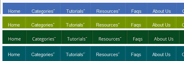
Responsive_Flat_Navigation_menuWe also discuss about the Creating A Responsive Web Design And Template. Do you want to create your own responsive menu for your website but don't know how ? In this post we will show 4 awesome responsive menus that you can use to build your own website.  For simple navigation, the solutions can be straight-forward. However, if you’re working on something a bit more complex, maybe with multiple nested lists and dropdowns, a more dramatic rearrangement may be in order. In this approach to responsive navigation, we’re going to use an approach that can accommodate large, multi-level navigation menus using media queries, whilst trying to keep our markup simple and our external resources minimal. In this article you will see how you can build an awesome CSS3 animated Responsive dropdown menu.

Introduction: Creating a Responsive Web Design and Template

Reponsive Moniter, Tablet and Smart PhoneResponsive templates are necessary to have a website display correctly on every device. To begin creating your own Responsive Template, you will need to understand the CSS media property and what type of screens mobile phones, tablets and desktop computers are. Designing Mobile Responsive Templates has become a trending topic in web today. Mobile Technology and Mobile Traffic has evolved massively from 2011 to 2013, People now prefer reading articles on their Tablet, IPhone, Smart Phone. You can create your own Responsive Web Design (RWD) using HTML and CSS. Before we get started, we will need to get an idea of what we need to do to create the Responsive Template. We are releasing the first ever complete step by step Tutorial Guide on Responsive Blogger Templates to the Google Blogger Community.

SDI: For All Your IPhone App Needs


Mobile_Development_Image


With app development fascination on the rise, Software Developers India (SDI) has been climbing to the top to deliver the best app solutions for your every need. Once you have finalized upon what kind of an application you want to develop and the level of complexity you can manage (remember that the cost of it increases with the level of complexity) you can choose your developer according to the service you need. We, SDI, are an award-winning Silicon Valley company based out of California. And we wish to provide you the best app solutions.


Don’t just jump on a quick decision when it comes to choosing your developers. The rapid rate at which iPhone app development companies are coming will obviously provide you with a large number of options. But there is always a chance of falling for the wrong one. You must have your own set of criteria for choosing companies, based on your requirements, budget, etc. Remember, that your requirements are yours alone. And you have to be very specific about extracting those unique requirements from the developers.


The ones you hire should understand your needs specifically and then provide you with the right kind of business solutions. So in a way, the organization you choose is basically your business client who applies the right kind of strategies needed for the functioning. Competitive analysis, social media strategies and user testing are some of the most important strategies that they usually focus on.


Now comes the design. Of course, there is no denying in the fact that you want your app to be the most attractive thing ever. This is where your company’s creativity cap is put on a test. Apart from the design being attractive in general, there are a couple things that have to be kept in mind. For example, visual palatability, interactive style guides and overall information architecture are some very important issues. These are some of the issues that they usually take care of.


Have you been through that reluctant phase where you didn’t know if your idea is at all presentable to the developers? You need not go through that unnecessary experience, as most of these companies offer a huge range of apps. Starting from business, education, social networking, entertainment, to travel, books, navigation, news, health and lifestyle. You just name it.


Your developers should also be efficient at project management. They would usually keep track of every minute progress of the project. They are also usually very careful about the deployment process. One small error in deployment can make the entire process go haywire.


Regular performance checks are quite mandatory to ensure best results post deployment. Carrying out is also an essential job of the company. As far as the time is concerned, developing an app is only a matter of a few hours. However, it also depends on the nature of the product you want.


We at SDI, are particular about the details of the development process. We have the best developers working for the benefits of each of our customers.


About the author – SAKSHI Sharma is working as mobility strategist at SDI and author of this article. She loves blogging and has vast knowledge on Mobile & Web app development. She can be reached at team@sdi.la or call on 408 802 2885. For more details Please Visit Software Developers India or Follow SDI on Google Plus to learn more!


How To Make Fast Loading Smartphones Website ?


mobile-website-2


This is a Guest Post By Adeel Zia. Smartphones have brought great change in all fields of life especially the way we use internet. Their excellent features made them the best options to access internet for different purposes. However, the issue is that web pages take more time to get loaded when accessed via smartphones. This delay reduces the users’ interest and affects the traffic on web pages. Research has revealed that to maintain users’ flow, the web page should be loaded within less than one second. Different techniques are used to improve the loading of pages. Some of them are as follows:


Selection of language


While making website for mobile devices, first step is to choose a suitable language. WML, cHTML, and XHTML are most suitable options available for this purpose. XHTML is the latest version so it can be considered the best for the latest devices and is better than its primary version, which is HTML.


Use of emulator


Use smartphone emulator to learn about the smartphone users experience on your website. It is better as it provides a broader view about a range of mobile devices accessing your site by replicating the scenario. This will help you to manage the amount of data on your website along with improving loading speed of your site.


Web site layout


As mobile devices have less physical space for displaying contents so you should select a suitable layout of your site for its display on smartphone. Try to display only most useful information to your target user rather making your site a second copy of your full website. It will affect the loading time and obviously the users’ experience for sure. 


Code optimization


Use of complex and inefficient JavaScript codes for web pages takes more time to execute and as a result increases the loading time of the page. It the best option to use efficient JS coding as ATF essence of the web page. It will improve the loading speed of the web pages for smartphones.


Efficient use of JS and CSS


Use of JS and CSS in web page development involves the need of downloading an external resource that includes downloading time and also increases the round trips to the server. All this slows down the loading of website. This can be handled by using JS and CSS coding efficiently in the content of web pages. The best way to manage is using JavaScript and CSS inline coding for ATF contents and external blocking in the rest of web contents.


Above the fold content


In this technique, some top contents load within less than one second to engage the users and rest of the page continues to load in background. You may maintain this feature by using HTML, CSS, and JS in your web pages. This approach is also known as critical rendering path.


Quick server Response


To load the website promptly on smartphones, one useful method is make server response faster. Reduction in server response time less than 200 milliseconds will improve the website loading time. Thus, you can say that the use of faster web server for mobile websites will enhance the loading speed for mobiles.


Less HTTP redirects


Avoiding HTTP redirects will increase the loading speed for web pages on smartphones, as each redirect enjoys a new trip to the server for respond and increases the loading time more than 1 second. Securing this waste of time will improve the performance.


Small ATF data


Mostly used protocol for internet is TCP, which takes a slow start for data transmission when receives a request. It initially sends maximum 10 packets in its latest versions and after getting acknowledgement from users, utilizes the full available bandwidth for data transmission. Below 14K ATF data increases the site loading speed as above the content data is sent in early packets under TCP protocol and engages the user.


This post is written by Adeel Zia. A blogger and social media marketing nerd, his main interest is internet marketing and SEO monitoring.